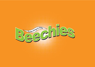
So we start our three week brand challenge. Challenge 1: The Re-Brand of Beechies. Time to bring Beechies back to life! Trying to keep the fruity feel as well as the to good to share campaign. So here's what I've come up with :)
After all the technical things like the Brand Value, DNA and Architecture of the brand, we got a chance to sit down and put our pens to paper. When fingers to the keyboard in this case. Firstly, We needed a logo. Above is my logo development. Trying to change the original logo to look like a new product without actually changing the entire thing was pretty hard. Here is the end result (Below)
Second attempt (Below)
Final Packaging
And lastly the adverts. I approached this in two different ways. First I looked at the "Too good to share"and came up with a don't forget your Beechies. My adverts included images of a Beechies box in a fresh pair of pants because you would hate to forget your Beechies Bubblegum
Second idea, I decided on the fruity aspect. True fruit in a rectangle.


No comments:
Post a Comment